

 Have you ever landed on a nonprofit website or a business website and instantly wanted to learn more? You are called to look further into it, you are just curious.
Well, there is a science behind this and the web designer probably understood the 4 basic rules of website design layout.
Simply placing colorful or attractive images on your website is not enough, you need to consider the impact each image may have. David Ogilvy, a legendary advertising guru, did an in-depth study on the subject and came back with some surprising facts.
His study wasn’t on web design but rather on print advertising but the exact same rules apply here. Here is what he discovered:
Have you ever landed on a nonprofit website or a business website and instantly wanted to learn more? You are called to look further into it, you are just curious.
Well, there is a science behind this and the web designer probably understood the 4 basic rules of website design layout.
Simply placing colorful or attractive images on your website is not enough, you need to consider the impact each image may have. David Ogilvy, a legendary advertising guru, did an in-depth study on the subject and came back with some surprising facts.
His study wasn’t on web design but rather on print advertising but the exact same rules apply here. Here is what he discovered:
- Main image placement matters When looking at a page, the process involves a very specific order. We first look at the main image, then we scan for the headline, then we read the body (only if the headline is interesting)
- The site’s headline isn’t amazing, but it’s at least below the main image where it will get readThe study found that headlines placed below the main image are read 10% more than headlines above. So by ignoring this rule, you have the potential to lose 10% of your readers who will not read anything and move on to another site or page. Think of it this way: if you have 10,000 people visiting your site per year, that could mean losing 1,000 people with that basic mistake!
- Captions get read 4 x more than the copy Yes, 4 times more, this is nothing to sneeze at. Not using a caption or not using them correctly would mean missing out on engaging your reader to keep reading and learn more.
 A simple caption under a photo should always be includedSo, if most people will read the caption first, you better make sure that you have a caption below all the images and make it count, make it appealling. If you know that they will read this first and foremost, make it compelling!!
 - Don’t break the left margin in the body of the text The study shows that when people read, they rely on the left margin as an anchor, where your eyes will return, to get to the next line.
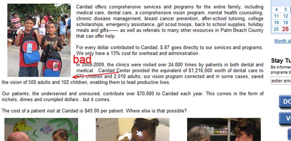 this screenshot demonstrates a left justified picture which breaks the left margin…a no-noThe left justified picture will break the reader’s flow and force them to re-adjust. It’s a small detail but this simple adjustment could have a ripple effect on your SEO. If they read the entire copy, then they’ll stay longer on your site thus improving dramatically the time spent on site and improve your ranking.
 the same web page with the picture aligned to the right is easier to read according to the research
 - Avoid irrelevant pictures Make sure the pictures are clearly tied to what you are offering, or at least consistent with the theme of your landing page. You also have to be careful with using stock photography. If it’s obvious that the pictures are showing models posing for the camera, then the viewer will be left with a sense of dullness and lack of imagination. An attractive model on a picture does not make it necessarily effective.
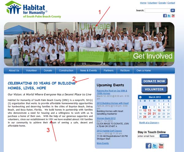
 2 mistakes with this photo, they are obviously models and it’s a crowd shot the best kinds of images to use are:
- Images with a story appeal An image with a strong sense of curiosity, such that the reader wants to know what the content is about.
- Images that demonstrate A picture is worth a 1000 words. What are your pictures saying?
- Obvious stock photography: If the reader is left with “Yeah right…that’s really how their support team looks like….everybody is thin, good looking and wears designer clothes…hum”….I think you get the point, avoid those pictures! If you need to go with stock photography, try to pick something that is as close to reality as possible.
- Poor quality images: This goes without saying, but I still see those now and then. Pixelated or distorted pictures is really a big turn off for most people. Your mother may forgive you and tell you it looks pretty, but the rest of us won’t be that kind.
- Crowd shots: Most people prefer photos with a single main subject rather than a crowd. With a crowd, people will try to focus on a person in the shot and will be distracted.